10 minute tutorial
Contents
This tutorial is an introduction to tunacell’s features. A script is
associated in the Github repository at scripts/tutorial.py.
If you cloned the repo, you can use the Makefile recipe make tuto.
You do not need to plug in your data yet, as we will use numerically simulated data.
Generating data
To generate data, you can use the tunasimu command from a terminal:
$ tunasimu -s 42
where the seed option is set to generate identical data that what is exposed on this page. The terminal output should resemble:
Path: /home/joachim/tmptunacell
Label: simutest
simulation: 100%|██████████████████████████████████████████████████████████████████████| 100/100 [00:00<00:00, 113.94it/s]
The progress bar indicates the time it takes to run the numerical simulations.
A new folder tmptunacell is created in your home directory, it contains a
fresh new experiment called simutest, composed of numerically
generated data, and everything needed for tunacell’s reader functions to work
out properly. The name simutest is set by default; it can be set otherwise
using the -l option, though keep in mind other scripts are set to read the
simutest by default.
Note
If you are not familiar with the term “numerical simulations”, it means generating “fake” data, that look like what would be observed in actual experiments, but are constructed with controled, specific assumptions. Our assumptions are described in Numerical simulations in tunacell.
In a nutshell, we generate fake, controled data about cells that grow and divide.
By typing:
$ cd
$ cd tmptunacell
$ ls
simutest
you should see this new subfolder. If you cd in this subfolder you will see:
$ cd simutest
$ ls
containers descriptor.csv metadata.yml
The containers folder contains data, the descriptor.csv describes the
columns in data files, and finally the metadata.yml file associates
metadata to current experiment.
We’ll discuss more details about the folder/files organization in Input file format.
Loading data
tunacell is able to read one time-lapse experiment at a time.
Let’s open a Python session (or better, IPython) and open our recently simulated
experiment.
We are still in the tmptunacell folder when we start our session.
To load the experiment simutest in tunacell, type in:
>>> from tunacell import Experiment
>>> exp = Experiment('simutest')
(note that if your Python console is launched elsewhere, you should rather
provide the path to the simutest folder, e.g. /home/joachim/tmptunacell/simutest)
Ok, we’re diving in. Let’s call print about this:
>>> exp
Experiment root: /home/joachim/tmptunacell/simutest
Containers:
        container_001
        container_002
        container_003
        container_004
        container_005
        ...
        (100 containers)
birth_size_params:
  birth_size_mean: 1.0
  birth_size_mode: fixed
  birth_size_sd_to_mean: 0.1
date: '2018-01-27'
division_params:
  div_lambda: 0
  div_mode: gamma
  div_sd_to_mean: 0.1
  div_size_target: 2.0
  use_growth_rate: parameter
label: simutest
level: top
ornstein_uhlenbeck_params:
  noise: 8.897278035522248e-08
  spring: 0.03333333333333333
  target: 0.011552453009332421
period: 5.0
simu_params:
  nbr_colony_per_container: 2
  nbr_container: 100
  period: 5.0
  seed: 42
  start: 0.0
  stop: 180.0
The exp object shows up:
- the absolute path to the folder corresponding to our experiment;
- the list of container files;
- the experiment metadata, which summarizes the content of the
metadata.ymlfile. When data is numerically simulated, parameters from the simulation are automatically exported in the metadata file.
To visualize something we need to select/add some samples.
Selecting small samples
To work with hand-picked, or randomly selected samples, we use:
>>> from tunacell import Parser
>>> parser = Parser(exp)
Let’s add a couple of samples, a first one that we know it exists if you used
default settings (in particular the seed parameter), and another random sample
that will differ from below:
>>> parser.add_sample(('container_079', 4))  # this one works out on default settings
>>> parser.add_sample(1)  # add 1 random sample default settings have not been used
  index  container        cell
-------  -------------  ------
      0  container_079       4  # you should see this sample
      1  container_019      21  # this one may differ
The particular container label and the cell number you’ve got on your screen is
unlikely to be the same as the one I got above. The container label indicates
which container file has been open, and the cell identifier indicates which cell
has been randomly selected in this container file. This entry is associated to
index 0, the starting index in Python.
Inspecting small samples
Cell
Type in:
>>> cell = parser.get_cell(0)
>>> print(cell)
4;p:2;ch:-
cell is the Cell instance associated to our cell sample.
The print call shows us three fields separated by semicolons.
The first field is the cell’s identifier; the second field indicates the
parent cell identifier if it exists (otherwise it’s a - minus sign);
the third field indicates the offspring identifiers (again a - minus sign indicates
this cell has no descendants).
Raw data is stored under the .data attribute:
>>> print(cell.data)
[(130., 0.01094928, 0.08573655, 1.08951925, 4, 2)
 (135., 0.01019836, 0.13886413, 1.14896798, 4, 2)
 (140., 0.01016952, 0.18872295, 1.20770631, 4, 2)
 (145., 0.00969319, 0.23829265, 1.26908054, 4, 2)
 (150., 0.01036414, 0.28900263, 1.33509524, 4, 2)
 (155., 0.01128818, 0.34241417, 1.40834348, 4, 2)
 (160., 0.01110128, 0.39900286, 1.49033787, 4, 2)
 (165., 0.01161387, 0.45529213, 1.57663389, 4, 2)
 (170., 0.0111819 , 0.5127363 , 1.66985418, 4, 2)
 (175., 0.0117796 , 0.56991253, 1.76811239, 4, 2)]
This is a structured array with column names:
>>> print(cell.data.dtype.names)
('time', 'ou', 'ou_int', 'exp_ou_int', 'cellID', 'parentID')
We can spot three recognizable names: time, cellID, and parentID.
They give the acquisition time of current row frame, the cell identifier,
and its parent cell identifer (0 is reserved to mention ‘no parent cell’).
The other column names are a bit cryptic because they come from numerical
simulations (see in Numerical simulations in tunacell for more information). What we need to know so
far is that exp_ou_int is synonymous with “cell size”, and ou is
synonymous of “instantaneous cell size growth rate”. We intentionnally keep
this cryptic names to remember we are dealing with “fake data”.
Plotting small samples
To plot some quantity, we first need to define the observable from raw data. Raw data is presented as columns, and column names are what we call raw observables.
Defining the observable to plot
To define the observable to plot, we are using the Observable object
located in tunacell’s main scope:
>>> from tunacell import Observable
and we will choose the cryptic exp_ou_int raw column in our simulated
data, and associate it to the “size” variable:
>>> obs = Observable(name='size', raw='exp_ou_int')
>>> print(obs)
Observable(name='size', raw='exp_ou_int', scale='linear', differentiate=False, local_fit=False, time_window=0.0, join_points=3, mode='dynamics', timing='t', tref=None, )
The output of print statement recapitulates all parameters of the observable. A more human-readable output by using the following method:
>>> print(obs.as_string_table())
parameter      value
-------------  ----------
name           size
raw            exp_ou_int
scale          linear
differentiate  False
local_fit      False
time_window    0.0
join_points    3
mode           dynamics
timing         t
tref
We’ll review the details of Observable object in the
Observable section.
Calling the plotting function
Now that we have a colony, we would like to inspect the timeseries of our chosen observable in the different lineages. To do this, we import the main object to plot samples:
>>> from tunacell.plotting.samples import SamplePlot
And we instantiate it with our settings:
    >>> myplot = SamplePlot([colony, ], parser=parser)
    >>> myplot.make_plot(obs)
>>> myplot.save(user_bname='tutorial_sample', add_obs=False)
To print out the figure:
>>> myplot.fig.show()
or when inline plotting is active just type:
>>> myplot.fig
If none of these commands worked out (that would be fairly strange), you can open the file that has been saved in:
~/tmptuna/simutest/sampleplots/
as tutorial_sample-plot.png.
You should see something that looks like:
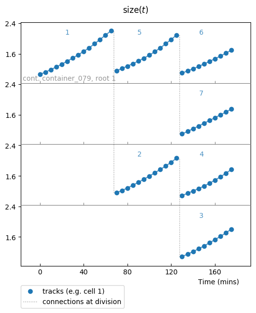
Timeseries of a given observable (here size) in all cells from a colony.
Our cryptic exp_ou_int raw data stands in fact for a quantifier of the size
of our simulated growing cells, and this plot shows you how size of cells
evolves through time and rounds of divisionsin the same colony. This plot
shows how this quantity evolves in time, as well as the tree structure divisions
are making.
Further exploration about plotting timeseries of small samples is described in Plotting samples
Statistical analysis of the dynamics
The core of tunacell is to analyze the dynamics through statistics.
Warning
It gets a bit tougher to understand the following points if you’re not familiar with concepts of random processes.
Let’s briefly see how one can perform pre-defined analysis.
First, instead of looking at our previous observable, we will look at the
basic ou observable:
>>> ou = Observable(name='growth-rate', raw='ou')
It describes a quantity that fluctuates in time around a given average value. One is then interested in inspecting three main things: what is the average value at each time-point of the experiment? how much are the typical deviations from this average value, at each time-point? And how far these fluctuations propagate in time?
We load a high level api function that perform the pre-defined analysis on single observables in order to answer these 3 main questions:
>>> from tunacell.stats.api import compute_univariate
>>> univariate = compute_univariate(exp, ou)
The first time such a command is run on current exp instance, tunacell will
parse all data and count how much containers, cells, colonies, and lineages
are present. Such a count is printed and should be:
Count summary:
 - cells : 2834
 - lineages : 1517
 - colonies : 200
 - containers : 100
After such a count is performed, a progress bar informs about the time needed to parse data in order to compute univariate statistics. Results can be exported in a structured folder using:
>>> univariate.export_text()
This object univariate stores our statistical quantifiers for our single
observable ou. There are functions to generate plots of the results
stored in such univariate object:
>>> from tunacell.plotting.dynamics import plot_onepoint, plot_twopoints
We make the plots by typing:
>>> fig = plot_onepoint(univariate, show_ci=True, save=True)
>>> fig2 = plot_twopoints(univariate, save=True)
It generates two plots. If they have not been printed automatically, you can open the pdf files that have been saved using the last line. They have been saved into a new bunch of folders:
~/tmptuna/simutest/analysis/filterset_01/growth-rate
The first one to look at is plot_onepoint_growth-rate_ALL.png, or by typing:
>>> fig.show()
It should print out like this:
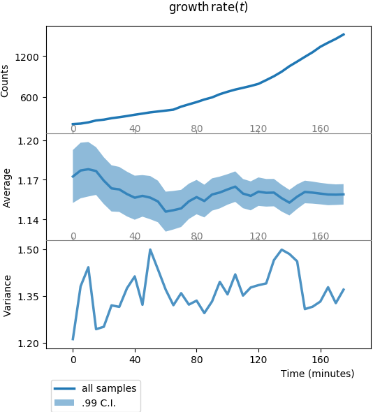
Plot of one-point functions: counts, average, and variance vs. time.
This plot is divided in three panels. All panels share the same x-axis, time (expressed here in minutes).
- The top panel y-axis,
Counts, is the number of samples at each time-point (number of cells at each time-point); through divisions, this number of cells should increase, roughly exponentially; - The middle panel y-axis,
Average, is the sample average of our observableou(remember, this is our simulated stochastic process), the shadowed region is the 99% confidence interval; here the average value is stable, because our stochastic process is made like this; - The bottom panel y-axis,
Variance, is the sample variance of the data (this is the square of the standard deviation shadow on middle panel, replotted here for convenience); again the standard deviation is stable, up to estimate fluctuations due to finite-size sampling.
The second plot to look at is plot_twopoints_growth-rate_ALL.png, or:
>>> fig2.show()
which should print like this:
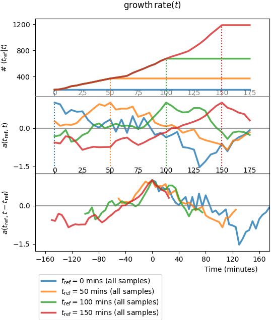
Plot of two-point functions: counts, autocorrelation functions, and centered superimposition of autocorrelation functions vs.time.
This plot is again divided in three panels. And for each panel, there are 4 curves that represent the autocorrelation function \(a(s, t)\) for four values of the first argument \(s = t_{\mathrm{ref}}\). The top two panels share the same x-axis:
- top-panel y-axis,
Counts, is the number of independent lineages connecting \(t\) to \(t_{\mathrm{ref}}\) (one colour per \(t_{\mathrm{ref}}\)); - mid-panel y-axis,
Autocorr., is the autocorrelation functions; - bottom panel superimposes the autocorrelation functions for the 4 different \(a(t_{\mathrm{ref}}, t)\).
Auto-correlation functions obtained directly by reading the auto-covariance
matrix, as represented above, are quite noisy since the number of samples,
i.e. the number of lineages connecting a cell at time \(t_{\mathrm{ref}}\)
to a cell at time \(t\) is experimentally limited (in our numerical
experiment we’re reaching \(10^3\) for the red curve when \(t\) is close
to \(t_{\mathrm{ref}}=150\) mins, which begins to be acceptable).
tunacell provides tools
to compute smoother auto- and cross-correlation functions when some conditions
are required. It goes beyond the purpose of this introductory tutorial to
expose these tools: you can learn more in a the specific tutorial
how to compute the statistics of the dynamics, or
in the paper.
What to do next?
If you are eager to explore your dataset, check first
how your data should be structured so that tunacell
can read it. Then
you may check how to set your analysis,
how to customize sample plots,
and finally how to compute the statistics of the dynamics,
in particular with respect to conditional analysis.
Enjoy!