Plotting samples
To gain qualitative intuition about a dataset, it is common to visualize
trajectories among few samples. tunacell provides a
matplotlib-based framework to visualize timeseries as well as the underlying
colony/lineage strutures arising from dividing cells.
Note
In order for the colour-code to work properly, matplotlib must be updated to a version >=2.
In this document we will describe how to use the set of tools defined in
tunacell.plotting.samples.
We already saw in the 10 minute tutorial a simple plot of length vs. time in a colony from our numerical simulations. Here we will review the basics of plotting small samples in few test cases.
Note
If you cloned tunacell repository, there are two ways of executing
quickly the following tutorial.
You may run the script plotting-samples.py with the following command:
python plotting-samples.py -i --seed 951
The seed is used to select identical samples as the one printed below.
Alternatively it can be run from the root folder using the Makefile:
make plotting-demo
If you execute one of the commands above, there is no need to run the commands below. Follow the command line explanations and cross-reference it with the following commands to understand how it works. If you didn’t execute the commands above, you can run sequentially the commands below.
Contents
Setting up samples and observables
For plotting demonstration, we will create a numerically simulated experiment, where the dynamics is sampled on a time interval short enough for the colonies to be of reasonable size. Call from a terminal:
tunasimu -l simushort --stop 120 --seed 167389
In a Python script/shell, we load data with the usual:
from tunacell import Experiment, Parser, Observable, FilterSet
from tunacell.filters.cells import FilterCellIDparity
from tunacell.plotting.samples import SamplePlot

exp = Experiment('~/tmptunacell/simushort')
parser = Parser(exp)
np.random.seed(seed=951)  # uncomment this line to match samples/plots below
parser.add_sample(10)

# define a condition
even = FilterCellIDparity('even')
condition = FilterSet(filtercell=even)

# define observable
length = Observable(name='length', raw='exp_ou_int')
ou = Observable(name='growth-rate', raw='ou')
We have defined two observables and one condition used as a toy example.
With these preliminary lines, we are ready to plot timeseries. The main object
to call is SamplePlot, which accepts the following parameters:
samples, an iterable overColonyorLineageinstances- the
Parserinstance used to parse data, - the list of conditions (optional).
We already saw how to define instances of the class Observable.
Samples can be chosen samples, or random samples from the experiment. We will
review below the different cases with concrete examples from our settings.
We have 10 samples in our parser, that have been chosen randomly.
Remember that they can also be specified on purpose with the container and
cell identifiers. Once stored in the parser object, they can be addressed by
their index in the table; to check the table of samples, call:
print(parser)
If you used the default settings, you should observe:
  index  container        cell
-------  -------------  ------
      0  container_015       3
      1  container_087      14
      2  container_002       6
      3  container_012      12
      4  container_096      15
      5  container_040       8
      6  container_088      14
      7  container_007       1
      8  container_042       2
      9  container_013       5
How to plot a colony sample
We start from the basic example initiated in the 10 minute tutorial:
colony = parser.get_colony(0) # any index between 0 and 9 would do
and we call our plotting environment:
colplt = SamplePlot([colony, ], parser=parser, conditions=[condition, ])
The first argument is an Observable instance, the second the sample(s)
to be plotted, then it is more explicit. Conditions must be given as a list of
FilterSet instances (the list can be left empty).
Using default settings
We start with the default settings and will inspect the role of each parameter:
colplt.make_plot(length)
The figure is stored as the fig attribute of colplt:
colplt.fig.show() # in non-interactive mode, colplt.fig in interactive mode
This kind of plot should be produced:
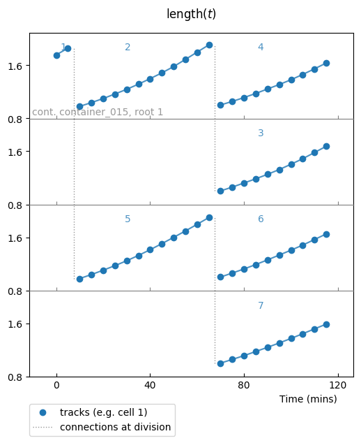
Timeseries of length vs time for one colony, default settings.
The default settings for a colony plot display:
- one lineage per row (it comes from keyword parameter
superimpose='none'), - cell identifiers on top of each cell (
report_cids=True), - container and colony root identifiers when they change,
- vertical lines to follow divisions (
report_divisions=True).
Data points are represented by plain markers (show_markers=True)
and with underlying, transparent connecting lines for visual help
(show_lines=True).
Title of plot is made from the Observable.as_latex_string() method.
Visualization of a given condition
The first feature we explore is to visualize whether samples verify a given
condition. To do so, use the report_condition keyword parameter:
colplt.make_plot(length, report_condition=repr(condition))
Conditions are labeled according to their representation, this is why we used
the repr() call.
Now the fig attribute should store the following result:
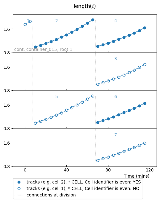
Timeseries of length vs time for one colony. Plain markers are used for samples that verify the condition (cell identifier is even), empty markers point to samples that do not verify the condition.
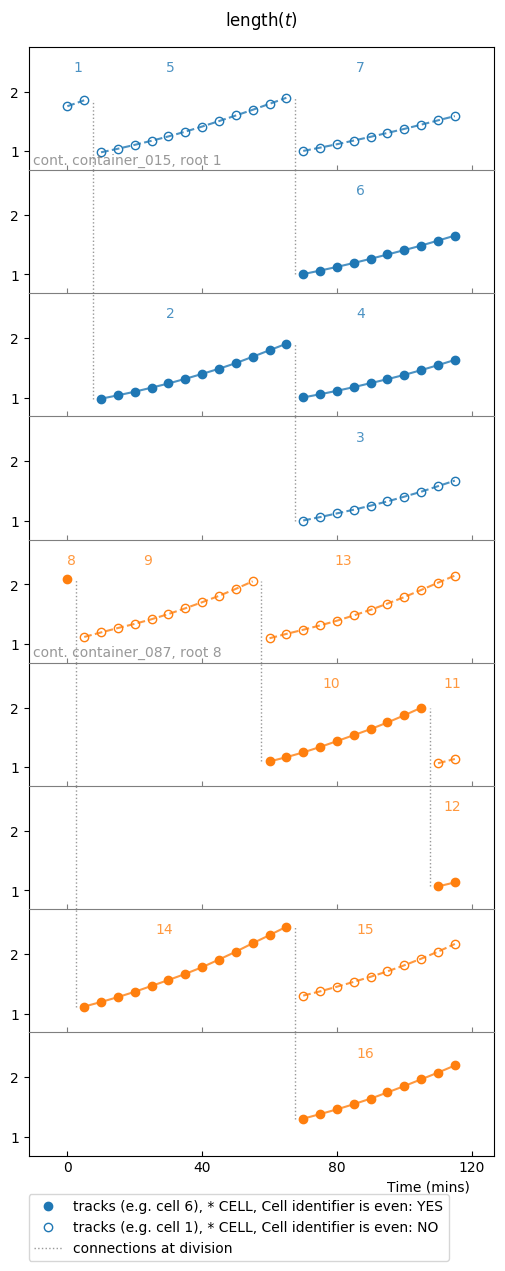
Colouring options
Colour can be changed for distinct cells, lineages, colonies, or containers (given in order of priority), or not changed at all.
Changing cell colour
colplt.make_plot(length, report_condition=repr(condition), change_cell_color=True)

Colour is changed for each cell, and assigned with respect to the generation index of the cell in the colony. This allows to investigate how generations unsynchronize through time.
Changing lineage colour
colplt.make_plot(length, report_condition=repr(condition), change_lineage_color=True)

Colour is changed for each lineage, i.e each row in this colony plot.
Superimposition options
The default setting is not to superimpose lineages. It is possible to change
this behaviour by changing the superimpose keyword parameter. Some
keywords are reserved:
'none': do not superimpose timeseries,'all': superimpose all timeseries into a single row plot,colony: superimpose all timeseries from the same colony, thereby making as many rows as there are different colonies in the list of samples,container: idem with container level,
and when an integer is given, each row will be filled with at most that number of lineages.
For example, if we superimpose at most 3 lineages:
colplt.make_plot(length, report_condition=repr(condition), change_lineage_color=True,
             superimpose=3)
Superimposition of at most 3 lineages with superimpose=3. Once
superimpose is different from 'none' (or 1), the vertical lines
showing cell divisions and cell identifiers are not shown (what happens is
that the options report_cids and report_divisions are
overriden to False.
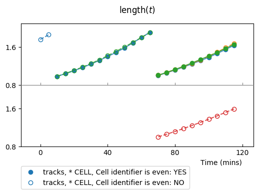
Plotting few colonies
So far our sample was a unique colony. It is possible to plot multiples colonies in the same plot, that can be given as an iterable over colonies:
splt = SamplePlot(parser.iter_colonies(mode='samples', size=2),
               parser=parser, conditions=[condition, ])
splt.make_plot(length, report_condition=repr(condition), change_colony_color=True)
Here we iterated over colonies from the samples defined in parser.samples.
First two colonies from parser.samples, with changing colony colour
option.
Now we will switch to the other observable, ou, which is the instantaneous
growth rate:
splt3.make_plot(ou, report_condition=repr(condition), change_colony_color=True,
                superimpose=2)
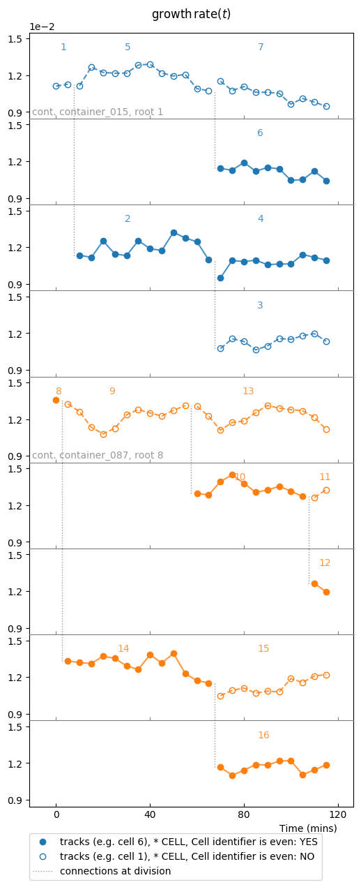
Same samples as above, but we changed the observable to growth rate.
We can also iterate over unselected samples: iteration goes through container files:
splt = SamplePlot(parser.iter_colonies(size=5), parser=parser,
                   conditions=[condition, ])
splt.make_plot(ou, report_condition=repr(condition), change_colony_color=True,
                superimpose=2)
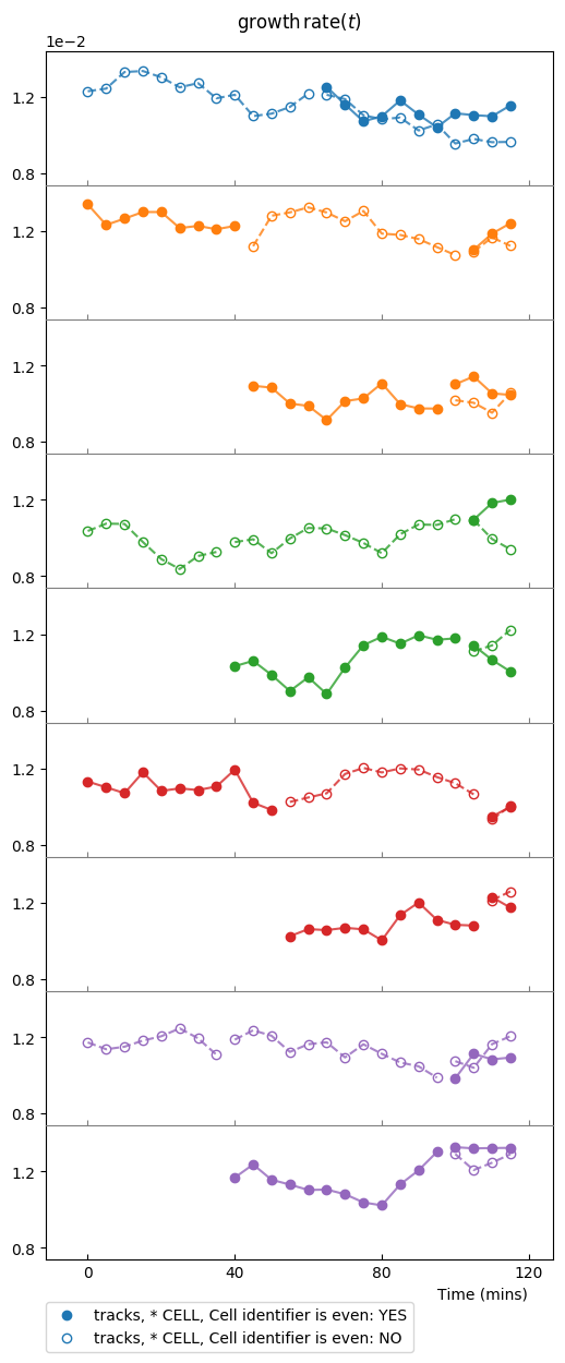
Two lineages are superimposed on each row. Colour is changed for each new colony.
To get an idea of the divergence of growth rate, it is better to plot all timeseries in a single row plot. We mask markers and set the transparency to distinguish better individual timeseries:
splt.make_plot(ou, change_colony_color=True, superimpose='all', show_markers=False,
                alpha=.6)
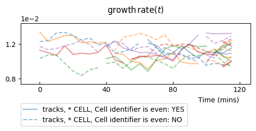
Lineages from the 5 colonies superimposed on a single row plot.
Plotting few lineages
Instead of a colony, or an iterable over colonies, one can use a lineage or an iterable over lineages as argument of the plotting environment:
splt = SamplePlot(parser.iter_lineages(size=10), parser=parser,
                   conditions=[condition, ])
splt.make_plot(ou, report_condition=repr(condition), change_lineage_color=True,
                superimpose='all', alpha=.6)
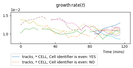
10 lineages from an iterator on a single row plot.
Adding reference values
One can add expectation values for the mean, and for the variance, to be plotted as a line for the mean and +/- standard deviations.
From the numerical simulation metadata, it is possible to compute the mean value and the variance of the process:
md = parser.experiment.metadata
# ou expectation values
ref_mean = float(md.target)
ref_var = float(md.noise)/(2 * float(md.spring))
and then to plot it to check how our timeseries compare to these theoretical values:
splt.make_plot(ou, report_condition=repr(condition), change_lineage_color=True,
                superimpose='all', alpha=.5, show_markers=False,
                ref_mean=ref_mean, ref_var=ref_var)
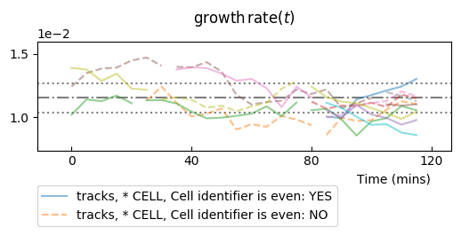
Timeseries from lineages are reported together with theoretical mean value (dash-dotted horizontal line) +/- one standard deviation (dotted lines).
Adding information from computed statistics
We sill review the computation of the statistics in the next document, but we
will assume it has been performed for our observable ou.
The data_statistics option is used to display results of statistics, which
is useful when no theoretical values exist (most of the time):
splt.make_plot(ou, report_condition=repr(condition), change_lineage_color=True,
            superimpose='all', alpha=.5, show_markers=False,
            data_statistics=True)
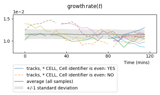
Data statistics have been added: grey line shows the estimated mean value and shadows show +/- one estimated standard deviation. Note that these values have been estimated over the entire statistical ensemble, not just the plotted timeseries.